Previews
Previews let you design a single piece of your UI on its own, away from the page that hosts it. A preview captures a control, page, UserControl, DataTemplate, or styled variant in a specific data state, so you can check how it looks and behaves without navigating your running app to the screen that uses it.
The more previews your project has, the easier it is to catch a layout or styling problem early — and because a preview is just XAML in your project, it travels with your code and stays in step with it.
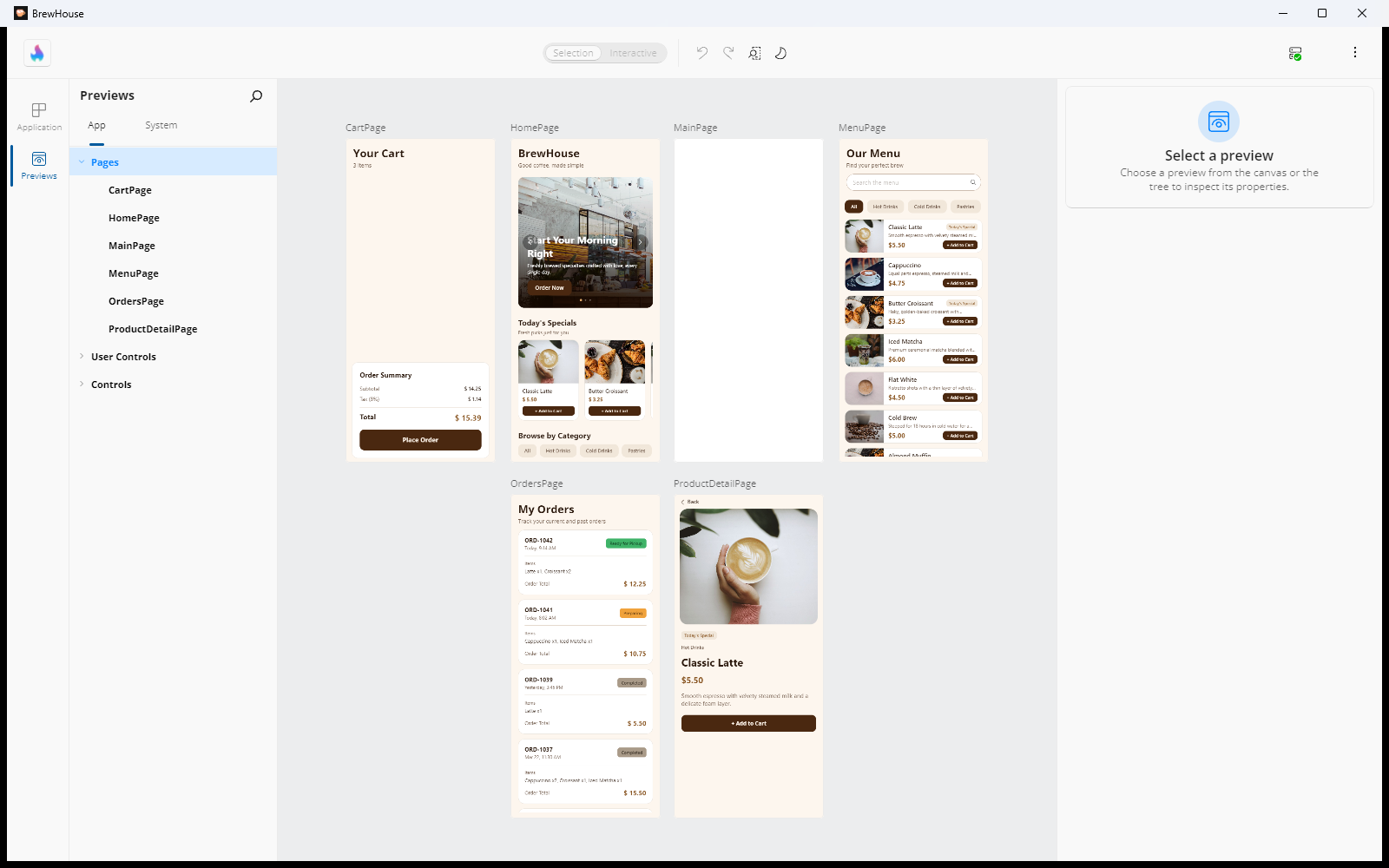
Switch between your app and your previews
When Hot Design is active, a narrow navigation bar runs down the left edge of the window with two entries:
- Application — design the live running app, as described in Canvas.
- Previews — design your previews on the same canvas.
Selecting Previews slides the Toolbox and Elements panels out and the Previews panel in, and shows previews on the canvas instead of the running app. Selecting Application brings your app and those panels back.
The Toolbox and Elements panels also come back as soon as you drill into a component from a preview — see Editing what a preview shows — so you can add controls to and restructure the component you are editing.
Each mode keeps its own state: your open editors, canvas size, zoom, and current selection are remembered per mode, so switching back and forth does not lose your place. Hot Design also remembers which mode you were in and returns you to it the next time you enter Hot Design.
Note
Selection is not shared between the two modes. Switching modes clears the current selection and empties the Properties panel, so an edit you make in one mode can never land on an element you selected in the other.
Previews mode needs the tool panels to be shown in-app.
Important
Moving the tools to the external tool window switches the canvas back to Application mode, and Previews mode is unavailable while they are there.
The Previews panel
App and System tabs
The panel has two tabs:
- App — previews that come from your own application and from projects in your solution.
- System — previews that come from the framework, from installed themes (for example Material or SimpleTheme), and from referenced third-party libraries.
The App tab is selected by default. If your application produces no previews of its own, the tab bar is hidden and only the system catalog is shown.
Each tab remembers what you had selected. Switching to the other tab and back restores both the tree selection and what the canvas was showing, whether that was a single preview or a summary.
Note
Styles added to your application's resources from C# code (rather than from XAML) appear on the System tab, not the App tab. The System tab's meaning is "things you cannot edit in this project's XAML", and a style created in code is equally not editable in the designer.
The tree
Previews are grouped into a tree up to four levels deep — Category → Type → Style → Preview:
- On the App tab the top-level categories always appear in the same order: Pages, Data Templates, User Controls, Controls. A category with no items is not shown.
- On the System tab the top-level categories mirror the Toolbox categories (Inputs, Collections, Navigation, and so on, ending with General and Third Party).
- Where a type has more than one style, an Implicit Style node groups the previews that use no named style, and it is sorted before the named styles.
- Items within a level are ordered alphabetically.
- A type with exactly one preview and no named style collapses to a single selectable leaf, so you are not asked to expand a node with one child.
- Data Templates skip the type level: a keyed template appears directly under the category.
Selecting a node also expands it. Tapping a node's expand/collapse chevron toggles it without changing the selection, so you can tidy the tree while keeping a preview open on the canvas.
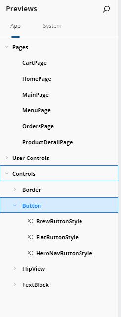
Search
Type in the panel's search box to filter both tabs. Only nodes matching the term — or with a matching descendant — stay visible, the matching part of each name is highlighted, and ancestors expand automatically to reveal the matches. If nothing matches on the active tab, a No matching results found. Clear input and try again message is shown.
Clearing the search restores the full tree and collapses it back to its category rows, keeping Pages expanded on the App tab. The row of the preview currently open on the canvas always stays visible, along with the rows it sits under.
Hot Reload indicators
When Hot Reload applies an update, every preview whose target type was updated is flagged with an update indicator, and the indicator propagates up to the ancestor group nodes so you can find it without expanding the whole tree. Selecting a flagged preview clears its indicator; an ancestor's indicator clears once nothing beneath it is still flagged.
The tree itself updates incrementally, so a Hot Reload keeps your scroll position, expansion state, selection, and active search filter.
Summaries
Selecting a category, type, or style node — anything with children — shows a summary on the canvas: one card per child, each rendering a live preview of it, with the title above and a count badge when the child has more than one preview. Clicking a card drills into the next level down or, for a leaf, opens that preview. Selecting a leaf node opens the individual preview directly.
There is no back button in a summary — the tree is the navigation. Clicking a card selects the matching tree node and expands its ancestors, so the tree and the canvas never disagree.
Summaries come in two shapes:
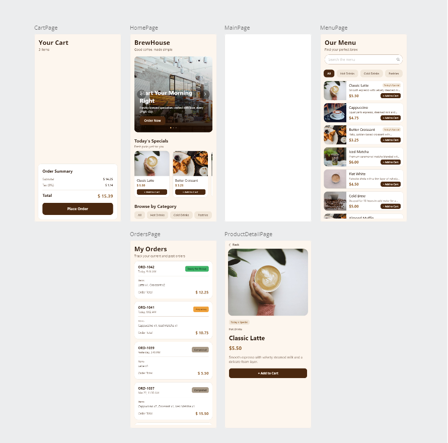
- Pages use cards shaped like the selected device: the page is laid out in the full device rectangle and cropped to it, so a short page shows trailing empty space rather than being squashed. Cards scale up to use the available canvas — never below a minimum size and never past 100% of the native device size — and Hot Design picks the row/column arrangement that makes the pages largest without scrolling. Changing the form factor re-lays-out and re-crops every card live.
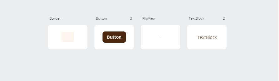
- Every other category (Controls, Data Templates, User Controls) uses a grid of fixed-size cards. A preview larger than its card is scaled down to fit; a smaller one is shown at its natural size rather than stretched.
In both shapes the cards wrap into centered rows, the grid scrolls vertically when the previews do not all fit, and titles stay a fixed size (truncated with an ellipsis rather than widening the card).
A Pages summary that would contain exactly one page opens that page directly instead of showing a one-card summary.
If a Hot Reload adds or removes previews under the category you have open, the summary refreshes to match without you re-selecting it. Editing the contents of an existing preview does not rebuild the summary — the affected card just re-renders.
A Pages summary — device-shaped cards, each rendering the page at its device size:
A Controls summary — the fixed-size card grid, with a count badge where a type has more than one preview:
Opening a preview
Selecting a leaf in the tree, or clicking a single-preview card in a summary, renders that preview on the design canvas in place of the running app. You can select and edit elements inside it exactly as you would on the application canvas.
How the canvas is sized depends on the kind of preview:
| Preview kind | Canvas size |
|---|---|
| Page | The current app size (the form factor), with auto-fit on so the page fills the canvas |
Control, UserControl, DataTemplate, style variant |
Unconstrained, so the content renders at its natural size, centered, at 100% zoom |
A size declared in XAML always wins. Set Width or Height on the <hd:Preview> element (or on its root child) and the canvas uses it; each dimension is resolved independently, so declaring only a width leaves the height to the rule in the table above. Changing a declared size — from the property grid or by editing and hot-reloading the XAML — re-sizes the canvas without reopening the preview, and keeps the zoom and pan you were working at.
Note
Hot Design offers no editor for a preview's size: it is read from your XAML and re-read when your XAML changes. A declared value that cannot be used (zero, negative, or too large to render) is ignored, the next source in the sequence supplies the dimension instead, and the reason is written to the log.
Selecting previews in quick succession is safe — only the last one finishes loading, and the intermediate over-sized state while a canvas is being measured is hidden, so there is no flash.
Canvas controls in Previews mode
The Form factor and Zoom flyout only offers what makes sense for what is on the canvas:
| On the canvas | Form factor section | Zoom section |
|---|---|---|
| Pages summary | Shown | Hidden |
| Any other summary | Hidden (the toolbar button is disabled) | Hidden |
| Individual page preview | Shown | Shown |
| Individual non-page preview | Hidden | Shown |
The Selection / Interactive toggle is disabled everywhere on the previews canvas — the previews surface has its own interaction handling. If Interactive mode was on when you switched to Previews, it is released and the toggle shows Selection; your saved preference is left alone, so returning to the application canvas does not silently drop it. The toggle becomes available again when you drill into a component from a preview, because that is a normal editing surface.
Editing what a preview shows
A preview from the System tab is read-only: it shows you the framework or theme rendering, and offers no edit affordance.
A preview you authored is editable. An Edit button appears at the bottom of the canvas; activating it enters in-place editing of the underlying component (the UserControl, page, or DataTemplate the preview wraps), and your changes are written back to that component's own XAML file — not to the preview.
Changes you make in a preview propagate to the running app. Switching back to Application mode, or selecting a different preview, flushes the pending edit first, so both surfaces show the same values.
Adding, duplicating, and deleting previews
Add
Hover or select a row in the tree and an inline Add preview button appears where a preview can be created from it:
- On a type or style row that has no children.
- On a read-only item row (for example a Default on the System tab) — creating an editable copy of a framework or theme rendering.
- On an auto-generated leaf row — one Hot Design produced for a type it discovered, such as a page under Pages.
Grouping rows with children show no add button, because each child row carries its own affordance. Category rows never offer add.
Clicking Add preview creates a new explicit preview for that type — and for that style, when you are on a style row. If your project has no default preview group file yet, one is created (XAML plus code-behind) in your configured previews folder first. Once the resulting Hot Reload completes, the tree refreshes and the new preview is selected and opened.
Duplicate
Hover or select a leaf row backed by a preview you authored and a Duplicate preview button appears instead. Duplicating produces a verbatim copy of the source preview's XAML — every attribute and the exact authored content — into the same preview group file as the source, named from the source with an incremental suffix (Sample → Sample_1 → Sample_2).
Note
A preview whose content declares an x:Name cannot currently be duplicated. Hot Design tells you so and writes nothing, rather than producing a file with a duplicate name in it.
Read-only previews and auto-generated previews offer Add rather than Duplicate, because copying them could only reproduce the control type and no authored content.
From the Properties panel
With a preview open, the Properties panel shows a preview section carrying the same actions:
- An editable preview shows a Duplicate preview (copy) button.
- A read-only preview shows an Edit preview (pencil) button, which creates a new editable preview of that control type and style.
- A preview that lives as a child of a preview group shows a Delete button.
Delete removes exactly the selected preview from its group's XAML — matched by identity, so two previews with the same display name are never confused — and confirms with Preview '{name}' successfully removed from the app. If the deleted preview was the one open on the canvas, the view navigates to its parent node.
Delete is not offered for a read-only or built-in preview, or for a standalone preview defined in its own file pair; those you remove by deleting the file yourself.
Undo, and what happens when a write fails
Adding and deleting a preview go through the same change pipeline as any other designer edit, so they appear in the undo history with a readable description (Adding preview 'X', Deleting preview 'X') as separate entries, and undo restores the owning group file.
Every outcome is reported. A failed file write shows the save-failure notification and no success notification, and leaves no stray history entry. A request that cannot be resolved shows a skip notification and writes nothing at all.
Note
Adding and duplicating previews require the previews feature grant and a resolvable previews folder. Where either is missing — including when Hot Design is running nested inside Studio Live — the Add and Duplicate buttons are hidden while browsing and opening existing previews keeps working.
Placeholder content
Some framework controls render blank with no content. When one of those is shown as a preview or as a summary thumbnail, Hot Design injects design-time sample content so the preview is meaningful. Those placeholders are a design-time convenience only — they never modify your source XAML.
A preview you authored yourself renders exactly what you declared, with no placeholder injection.
Defining previews in code
Previews live in your project, in the folder named by the HotDesignPreviewsFolder MSBuild property (Previews/ by default). Each hand-authored preview is a two-file unit: a XAML file whose root is <hd:Preview>, plus its code-behind decorated with the [Preview] attribute.
The simplest form wraps a control and names the preview:
<hd:Preview x:Class="MyApp.Previews.MyPagePreview"
            xmlns="http://schemas.microsoft.com/winfx/2006/xaml/presentation"
            xmlns:x="http://schemas.microsoft.com/winfx/2006/xaml"
            xmlns:local="using:MyApp.Views"
            xmlns:hd="using:Uno.UI.HotDesign">

    <local:MyPage />
</hd:Preview>
using MyApp.Views;
using Uno.UI.HotDesign;

namespace MyApp.Previews;

[Preview("My Page Preview", typeof(MyPage))]
public sealed partial class MyPagePreview : Preview
{
    public MyPagePreview() => this.InitializeComponent();
}
Override LoadDataContext() to supply the data the preview renders — a primitive value for a simple {Binding}, or a fully populated view model for a page:
[Preview("With Mock Data", typeof(MyPage))]
public sealed partial class MyPageMockPreview : Preview
{
    public MyPageMockPreview() => this.InitializeComponent();

    protected override object? LoadDataContext()
        => new MyPageViewModel
        {
            Title = "Preview — Mock Title",
            Items = ["Item A", "Item B", "Item C"],
        };
}
Two optional arguments change where the preview is grouped:
| Argument | Effect |
|---|---|
styleKey |
Groups the preview under the named style of the target type. Apply the same Style="{StaticResource …}" in the XAML. |
dataTemplateKey |
Places the preview under the Data Templates category. Set ContentTemplate="{StaticResource …}" on a ContentControl in the XAML, and return the template's data from LoadDataContext(). |
Set only one of the two. When dataTemplateKey is supplied, the controlType argument is ignored.
A preview group holds several named previews in one file; each child appears as its own entry in the tree, and children with no content are skipped. DefaultPreviews.xaml is the group Hot Design manages for you when you use the Add preview button — author your own previews as standalone files instead.
Any public, non-abstract control, UserControl, or page with a parameterless constructor gets an automatic Default preview on the App tab, so a new type shows up without you writing anything. As soon as you author an explicit preview for a type and style combination, the automatic Default for it is hidden.
Important
Resolving the previews folder needs an aligned Uno SDK that sets HotDesignPreviewsFolder. If your SDK only sets the older HotDesignStoriesFolder name, the build emits warning HDSG002: update the Uno.Sdk version to use previews.
Next steps
- Properties — edit the elements inside a preview
- Toolbox — add controls to a preview
- Canvas — the design surface previews share with your app
- Template Editor — edit a
DataTemplatein place from a preview