Template Editor
Entering the Template Editor
For properties that accept a template-like ItemTemplate in an ItemsRepeater, or ContentTemplate in a ContentControl - you can use the Template Editor to visually build and customize the template content.
To open the Template Editor, click the Create button next to the property in the Properties panel. If a template already exists, the button will say Edit instead. Clicking it takes you into the dedicated template editing area.
You can also reach a template without going through the Properties panel:
- Double-click an item on the canvas that was generated from the template.
- Right-click an element inside the template and choose Edit [<template property>].
- Pick the template from the Scope Selector tree.
Note
The Create / Edit button is disabled when the property's value is a template selector — there is no single template to open. Navigate to the individual branch you want from the Scope Selector, where a selector property groups its template branches beneath it.
Real Data, Not an Empty Shell
A DataTemplate used by a list with items is opened bound to one of the real items, so you are designing against the data your app actually has rather than an empty placeholder.
Using the Template Editor
The template editor opens a separate canvas where you can design and preview the structure of your template without affecting the rest of the UI.
From here, you can:
Drag and drop elements from the Toolbox into the Tree view or directly onto the Canvas.
Build the visual structure using standard controls and layout containers.
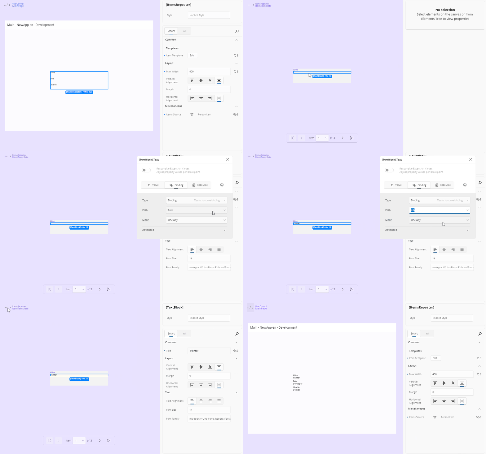
Bind UI elements to data by selecting a control, opening the Advanced Flyout for a property, and choosing from the available bindings based on the template's
DataContext.If your control already has a data source (e.g., an
ItemsRepeaterbound to a list), those data properties will be accessible within the template for binding.
In the Elements panel the template itself appears as a template root node, labelled [OwnerType].PropertyName — for example [ListView].ItemTemplate. It is a container rather than a selection: its children are the elements you edit. An empty template root accepts a drop from the Toolbox, as its single child.
Using x:Bind Inside a Template
To author compiled bindings inside a template, its x:DataType has to be set. Select the template root node and set it from the Identity category using its Set data type… field. Until it is set, the binding editor's path picker shows a Missing x:DataType for DataTemplate notice instead of the member list. See x:DataType.
Sizing the Template Surface
A template opens at the size it renders at in its list — the size of the element being designed — rather than at a page size. When that size cannot be determined, the surface falls back to a size derived from the parent list control's dimensions and orientation. Content that stretches to fill its place in the list — for example, an item that fills the width of a vertical list — fills the editing surface the same way, while keeping its own item height.
To set an exact size, open the Zoom/Size flyout from the toolbar: while editing a template it offers Width and Height inputs (and Zoom), so you can size the editing surface precisely. Device form-factor presets and the Window size / Canvas size shortcuts are not shown here, because a fixed device or window size is not meaningful for a template.
Opening the flyout does not resize the template — only a Width/Height value you enter changes it, and that change applies to the current editing session. Reopening the template (or opening it again in a later session) resolves its size from the template again rather than restoring a size you previously set.
Leaving the Template Editor
To exit the template editor and return to the main layout:
Click the Back icon at the top-left of the Canvas area, or
Use the Back icon in the top-left of the Tree view, or
Double-click an area outside the template's content on the canvas.
Once you return, the control's template will be updated with your changes, and you'll see them reflected in the main design view. The element the template belonged to becomes the selection, and every instance rendered from that template picks up your changes — not just the one you were looking at.
This includes templates that are shared. If the template is defined in a resource dictionary and used by controls on more than one page, every page currently loaded in the running app is rebuilt from the edited template, not only the page you opened the editor from. Controls bound to a different template are left untouched.
Note
Rebuilding a page from the edited template re-creates it, so anything transient that page was holding — scroll position, an in-progress selection, unsaved state in an input control — is reset. This applies to each page that uses the template you edited.
Leaving a template also restores the canvas settings of the context you return to: the page-level width, height, zoom, and auto-fit come back rather than the template's own dimensions.
Note
Each editor you drill into is pushed onto a stack, so you can nest a UserControl editor inside a template editor and unwind back the way you came. Application mode and Previews mode keep separate stacks — drilling into a template in one does not affect the other.
Next Steps
-
The Properties panel automatically selects the editor best suited for each property’s data type. Visit this page to explore all available editor types and when to use them.
-
Use the Advanced Flyout to choose how a property value is provided: enter a literal Value, set up a Binding, reference a Resource, or apply Responsive Extensions for adaptive layouts.
-
Responsive Extensions let you define multiple values for a single property based on screen size or form factor, ensuring your UI adapts seamlessly across devices.
-
A hands-on walkthrough for building the Counter App using Hot Design, showcasing its features and workflow in action.