Themes Overview
Important
UnoFeatures: Material, Cupertino, or SimpleTheme — enable these themes by adding <UnoFeatures>Material</UnoFeatures>, <UnoFeatures>Cupertino</UnoFeatures>, or <UnoFeatures>SimpleTheme</UnoFeatures> to your app's .csproj.
Summary
Cross-cutting guides shared by the theme libraries:
- Seed Color Palette — generate the full Light and Dark color theme from a single seed color (Material and Simple)
- Semantic Styles — design-system-agnostic style names, so you can switch themes without changing your XAML
- Design Tokens — spacing, shape, and density values you can adjust globally
- Lightweight Styling — override individual colors, brushes, and sizes per control without redefining the control template
Uno Themes Styles
Uno Themes is the repository for add-ons enabled through UnoFeatures that can be added to any new or existing Uno solution.
It contains four libraries:
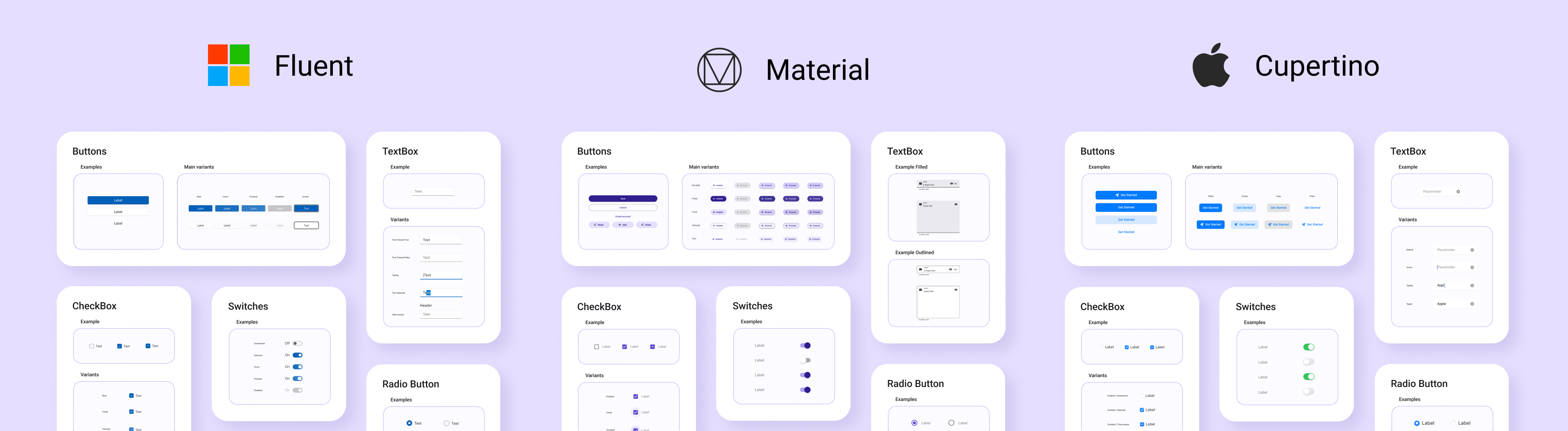
Uno Themes: a library that contains the base resources, extensions, and helper classes for the different design system librariesUno Material: a library that contains styles following the Material 3 Design SystemUno Cupertino: a library that contains styles following the Human Interface GuidelinesUno Simple: a library that contains styles following the Figma Simple Design System
Material, Cupertino, and Simple libraries help you style your application with a few lines of code including:
- Color system for both Light and Dark themes — customizable wholesale from a single seed color, or key-by-key via overrides, with helper classes such as
SemanticThemeHelperfor changing colors at runtime - Styles for existing WinUI controls like Buttons, TextBox, etc.
Fluent Controls Styles
Uno Platform 3.0 and above supports control styles conforming to the Fluent design system.