NavigationBar
Tip
This guide covers details for NavigationBar specifically. If you are just getting started with the Uno Material Toolkit Library, please see our general getting started page to make sure you have the correct setup in place.
Summary
The NavigationBar represents a specialized app bar that provides the layout for AppBarButton and navigation logic.
For a quick introduction to NavigationBar, you can check out our introductory video below:
This document highlights some of the differences you might encounter when working with the native mode of NavigationBar on either iOS or Android.
C#
public partial class NavigationBar : ContentControl
XAML
xmlns:utu="using:Uno.Toolkit.UI"
...

<utu:NavigationBar .../>
Inheritance
Object → DependencyObject → UIElement → FrameworkElement → Control → ContentControl → NavigationBar
Constructors
| Constructor | Description |
|---|---|
NavigationBar() |
Initializes a new instance of the NavigationBar class. |
Modes
The NavigationBar supports 2 different modes:
| Mode | Style |
|---|---|
| Windows | XamlDefaultNavigationBar |
| Native | NativeDefaultNavigationBar |
Windows
Under the hood, this mode uses a custom-styled CommandBar. It is templatable and supports a template that's almost identical to UWP's default CommandBar, except for the addition of a leading AppBarButton named MainCommand.


Usage Example
<Style TargetType="utu:NavigationBar" BasedOn="{StaticResource XamlDefaultNavigationBar}" />
Native
This mode is the default for Android and iOS. It uses platform-specific controls to ensure a more native user experience.
Android


iOS
| Platform | Native control | Benefits |
|---|---|---|
| Android | Toolbar |
Native pressed states (ripple), native overflow menu. |
| iOS | UINavigationBar |
Transitions when navigating between pages. |
The rest of this document will exclusively cover the native mode.
Usage Example
<Style TargetType="NavigationBar" BasedOn="{StaticResource NativeDefaultNavigationBar}" />
Remarks:
In this mode, the NavigationBar can't be fully customized like other templatable controls would. Additionally, you can't customize the visual states of either the NavigationBar or its AppBarButtons.
Padding
By default on iOS and Android, the VisibleBoundsPadding.PaddingMask on NavigationBar is set to Top to properly support the screen notch or punch-holes.
Properties
| Property | Windows | iOS | Android | Comments |
|---|---|---|---|---|
Background |
x | x | x | |
Content |
x | x | x | |
Foreground |
x | x | x | |
Height |
x | - | - | iOS and Android: Fixed and can't be changed. |
HorizontalAlignment |
x | - | x | iOS: Always use HorizontalAlignment.Stretch. |
Opacity |
x | x | x | |
Padding |
x | x | x | iOS and Android: Please refer to the Padding section. |
MainCommand |
x | x | x | |
PrimaryCommands |
x | x | x | |
SecondaryCommands |
x | - | x | iOS: Not supported. |
VerticalAlignment |
x | - | x | iOS: Always use VerticalAlignment.Top. |
Visibility |
x | x | x | |
Width |
x | - | x | iOS: Always use double.NaN. |
HorizontalContentAlignment |
x | - | x | Android: Stretch and Left are supported. Windows: Set IsDynamicOverflowEnabled="False" for proper behavior. |
VerticalContentAlignment |
x | - | - | Only supported on Windows. Android: Alignment needs to be done through the content itself. |
If it's not listed, assume it's not supported.
Background
Gets or sets a Brush that describes the background of a control.

Remarks:
- Only supports
SolidColorBrush. - Changing the opacity through
SolidColorBrush.Opacityis supported.
Content
Gets or sets the content of a ContentControl.
Remarks:
The Content is processed differently whether it is of type string or FrameworkElement.
When Content is a string, it's displayed using the platform's default font family, font size, font style, and text alignment. Only the foreground color can be changed, using Foreground.

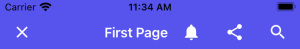
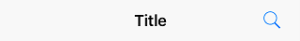
<utu:NavigationBar Content="Title">
  <utu:NavigationBar.PrimaryCommands>
    <AppBarButton Label="Share">
      <AppBarButton.Icon>
        <BitmapIcon UriSource="ms-appx:///Assets/Share.png" />
      </AppBarButton.Icon>
    </AppBarButton>
  </utu:NavigationBar.PrimaryCommands>
</utu:NavigationBar>
| Platform | FontFamily | FontSize | HorizontalAlignment |
|---|---|---|---|
| iOS | San Francisco | 17 | Center |
| Android | Roboto | 20 | Left |
| Platform | Available height |
|---|---|
| iOS | 30px |
| Android | 48px |
When Content is a FrameworkElement, it's displayed within the available area:

<utu:NavigationBar>
  <utu:NavigationBar.Content>
    <TextBox />
  </utu:NavigationBar.Content>
  <utu:NavigationBar.PrimaryCommands>
    <AppBarButton Label="Share">
      <AppBarButton.Icon>
        <BitmapIcon UriSource="ms-appx:///Assets/Share.png" />
      </AppBarButton.Icon>
    </AppBarButton>
  </utu:NavigationBar.PrimaryCommands>
</utu:NavigationBar>
Please note that:
HorizontalContentAlignmentandVerticalContentAlignmentare ignored.- On iOS, the Content is automatically centered horizontally unless
HorizontalAlignment.Stretchis used.
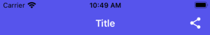
Foreground
Gets or sets a Brush that describes the foreground color.
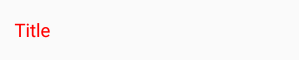

<utu:NavigationBar Content="Title"
                   Foreground="Red">
                   ...
</utu:NavigationBar>
Remarks:
- This is typically used to change the text color of the
Content. - Only supports
SolidColorBrush. - Setting this property will not affect the tint color of the
PrimaryCommandsorSecondaryCommands. If you need to change theAppBarButtoncolor, you should set theForegroundproperty on eachAppBarButtons individually.
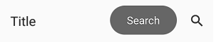
PrimaryCommands
Gets the collection of primary command elements for the NavigationBar.
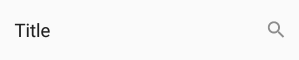
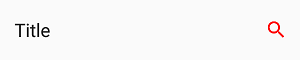
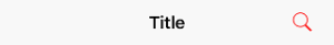
<utu:NavigationBar Content="Title">
  <utu:NavigationBar.PrimaryCommands>
    <AppBarButton Label="Search">
      <AppBarButton.Icon>
        <BitmapIcon UriSource="ms-appx:///Assets/Search.png" />
     </AppBarButton.Icon>
   </AppBarButton>
  </utu:NavigationBar.PrimaryCommands>
</utu:NavigationBar>
Remarks:
- Only supports
AppBarButton. AppBarToggleButtonandAppBarSeparatorare not supported.- Refer to the
AppBarButtonsection for details.
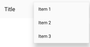
SecondaryCommands
Gets the collection of secondary command elements for the NavigationBar.

<utu:NavigationBar Content="Title">
  <utu:NavigationBar.SecondaryCommands>
    <AppBarButton Label="Item 1" />
    <AppBarButton Label="Item 2" />
    <AppBarButton Label="Item 3" />
  </utu:NavigationBar.SecondaryCommands>
</utu:NavigationBar>
Remarks:
- Not supported on iOS.
Height
Gets or sets the suggested height of a FrameworkElement.
Remarks:
The height is fixed and cannot be changed.
| Platform | Form factor | Portrait | Landscape |
|---|---|---|---|
| iOS | Phone | 44pt | 44pt |
| iOS | Tablet | 44pt | 44pt |
| Android | Phone | 48dp | 56dp |
| Android | Tablet | 64dp | 64dp |
MainCommandMode
The NavigationBar has a property named MainCommandMode that can be set to either:
MainCommandMode.Back(default)MainCommandMode.Action
MainCommandMode should be set to Action when the MainCommand is being used for anything other than backward navigation, such as displaying a burger menu or displaying a prompt to the user before the navigation occurs.
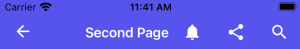
MainCommand
Gets or sets the AppBarButton that the NavigationBar will use for displaying a back arrow or custom icon.
Remarks:
Unlike the PrimaryCommands or SecondaryCommands, which appear to the right of the NavigationBar, the MainCommand is a special AppBarButton that appears to the left of the NavigationBar.
Whenever the NavigationBar is part of a Page whose Frame has a non-empty back stack, the back button will be displayed as long as the NavigationBar has its MainCommandMode set to Back.
If no MainCommand is provided in the XAML, the NavigationBar will render the native back button icons/text when appropriate.

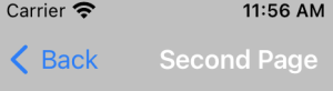
MainCommand is typically used for customizing the back button, displaying a different icon, and/or invoking some type of custom action other than back navigation when clicked.
On Android, only icons are supported (AppBarButton.Icon). This is due to a platform limitation, which can be explained by the fact that NavigationBar.Content is left-aligned.
Warning
Due to platform limitations on Windows only, a default back button icon is not provided out of the box. You will need to provide your own icon on each instance of the NavigationBar where you want to display a back button. On Android and iOS, the native default back button icon is used. On all other platforms, a back button icon is bundled in the default styles for the NavigationBar.
MainCommand Properties
Label
Gets or sets the back button title for the MainCommand.

<utu:NavigationBar Content="Title">
  <utu:NavigationBar.MainCommand>
    <AppBarButton Label="BackButtonTitle" />
  </utu:NavigationBar.MainCommand>
</utu:NavigationBar>
Remarks:
Only supported on iOS.
On iOS, the back button displays the title of the previous page (which we usually set as a string on the NavigationBar.Content property). When the title of the previous page is too long (over 140px wide on iPhone 5) or isn't set (for example, if we set FrameworkElement instead of string on NavigationBar.Content), "Back" will be displayed instead.
If navigating from ViewController A to ViewController B, B's back button text is determined either by A's NavigationBar.MainCommand.Label or by A's NavigationBar.Content as described previously.
To explicitly provide a value to be used by the back button of the next page, set the next page's MainCommand.Label.
To remove the back button title from all pages (and only leave the back arrow), set Label to "" in the default MainCommand style.
Foreground
Gets or sets the back button foreground for the MainCommand.
<utu:NavigationBar Content="Title">
  <utu:NavigationBar.MainCommand>
    <AppBarButton Foreground="Red" />
  </utu:NavigationBar.MainCommand>
</utu:NavigationBar>
OR
<Style x:Key="MyCustomAppBarButtonStyle" TargetType="AppBarButton">
  <Setter Property="Foreground"
            Value="Red" />
</Style>

  <Style TargetType="utu:NavigationBar">
      <Setter Property="MainCommandStyle"
              Value="{StaticResource MyCustomAppBarButtonStyle}" />
  </Style>
Remarks:
Only supports SolidColorBrush.
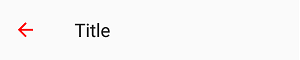
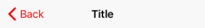
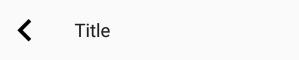
Icon
Gets or sets the back button icon for the MainCommand.
<utu:NavigationBar Content="Title">
  <utu:NavigationBar.MainCommand>
    <AppBarButton>
      <AppBarButton.Icon>
        <BitmapIcon UriSource="ms-appx:///Assets/Close.png" />
      </AppBarButton.Icon>
    </AppBarButton>
  </utu:NavigationBar.MainCommand>
</utu:NavigationBar>
Remarks:
Only supports BitmapImage on iOS/Android
Lightweight Styling
| Key | Type | Value |
|---|---|---|
NavigationBarCommandBarEllipsisIconForegroundDisabled |
SolidColorBrush |
TextFillColorDisabledBrush |
NavigationBarCommandBarBackgroundCompactOpenUp |
SolidColorBrush |
SurfaceBrush |
NavigationBarCommandBarBackgroundCompactOpenDown |
SolidColorBrush |
SurfaceBrush |
NavigationBarMainCommandForeground |
SolidColorBrush |
OnSurfaceBrush |
NavigationBarForeground |
SolidColorBrush |
OnSurfaceBrush |
NavigationBarBackground |
SolidColorBrush |
SurfaceBrush |
NavigationBarPadding |
Thickness |
4,0,0,0 |
NavigationBarFontFamily |
FontFamily |
TitleLargeFontFamily |
NavigationBarFontWeight |
String |
TitleLargeFontWeight |
NavigationBarFontSize |
Double |
TitleLargeFontSize |
MaterialModalNavigationBarMainCommandForeground |
SolidColorBrush |
OnSurfaceBrush |
MaterialModalNavigationBarForeground |
SolidColorBrush |
OnSurfaceBrush |
MaterialModalNavigationBarBackground |
SolidColorBrush |
SurfaceBrush |
MaterialPrimaryNavigationBarCommandBarEllipsisIconForegroundDisabled |
SolidColorBrush |
TextFillColorDisabledBrush |
MaterialPrimaryNavigationBarCommandBarBackgroundCompactOpenUp |
SolidColorBrush |
PrimaryBrush |
MaterialPrimaryNavigationBarCommandBarBackgroundCompactOpenDown |
SolidColorBrush |
PrimaryBrush |
MaterialPrimaryNavigationBarMainCommandForeground |
SolidColorBrush |
OnPrimaryBrush |
MaterialPrimaryNavigationBarForeground |
SolidColorBrush |
OnPrimaryBrush |
MaterialPrimaryNavigationBarBackground |
SolidColorBrush |
PrimaryBrush |
MaterialPrimaryAppBarButtonForeground |
SolidColorBrush |
OnPrimaryBrush |
MaterialPrimaryModalNavigationBarMainCommandForeground |
SolidColorBrush |
OnPrimaryBrush |
MaterialPrimaryModalNavigationBarForeground |
SolidColorBrush |
OnPrimaryBrush |
MaterialPrimaryModalNavigationBarBackground |
SolidColorBrush |
PrimaryBrush |
NavigationBarOverflowAppBarButtonForeground |
SolidColorBrush |
OnPrimaryBrush |
NavigationBarOverflowAppBarButtonBackground |
SolidColorBrush |
SolidColorBrush { Color = Transparent } |
NavigationBarEllipsisButtonForeground |
SolidColorBrush |
OnSurfaceBrush |
NavigationBarEllipsisButtonBackground |
SolidColorBrush |
SolidColorBrush { Color = Transparent } |
MaterialNavigationBarElevation |
Double |
4 |
MaterialXamlNavigationBarHeight |
Double |
64 |
MaterialNavigationBarHeight |
Double |
48 |
MaterialNavigationBarContentMargin |
Thickness |
16,0,0,0 |
MaterialAppBarEllipsisButtonInnerBorderMargin |
Thickness |
2,6,6,6 |
NavigationBarMaterialEllipsisButtonFontFamily |
FontFamily |
MaterialRegularFontFamily |
NavigationBarMaterialEllipsisButtonFontWeight |
FontWeight |
SemiBold |
NavigationBarMaterialEllipsisButtonFontSize |
Double |
ControlContentThemeFontSize |
NavigationBarMaterialEllipsisButtonWidth |
Double |
AppBarExpandButtonThemeWidth |
NavBarAppBarButtonContentHeight |
Double |
24 |
NavBarMainCommandAppBarButtonContentHeight |
Double |
16 |
NavBarAppBarThemeCompactHeight |
Double |
56 |
NavBarAppBarButtonPadding |
Thickness |
12,16 |
NavBarAppBarButtonHasFlyoutChevronVisibility |
Visibility |
Collapsed |
Navigation
The NavigationBar automatically hooks itself up to the SystemNavigationManager.BackRequested event and will attempt to navigate back by calling Frame.GoBack() as long as all of the following conditions are met:
MainCommandModefor theNavigationBaris set toMainCommandMode.Back- The
Framethat contains theNavigationBaris currently visible - The current
Pageof theFrameis equal to the parentPageof theNavigationBar
NOTE: SystemNavigationManager is not supported for WinAppSDK
The NavigationBar is also aware of its parent Page possibly being hosted in a Popup (for things like modal pages) and will close the Popup when attempting to navigate backward within the Popup while Frame.BackStack is empty.
Placement
On iOS, the same UINavigationBar instance is shared throughout all pages. When navigating between two pages, you can see that the UINavigationBar doesn't move, and only its content and the pages have a transition. To get the same effect for Uno's NavigationBar, the NavigationBar that you define inside your Page is never actually rendered there, and only serves as a placeholder from which to read the information we need to pass to the shared native UINavigationBar instance.
To ensure everything works properly, you must follow a few rules:
- The
NavigationBarmust stretch horizontally and be aligned with the top of yourPage - The
NavigationBarcan't move (i.e., don't put it inside aScrollViewer) - The
NavigationBarmust be accessible as soon as thePageis being navigated to (i.e., don't put it inside aDataTemplate) - There can only be one
NavigationBarperPage
Extensibility
The NavigationBar is automatically managed by the Frame control, however, you can still use the "native" mode of the NavigationBar with your own navigation mechanism.
On iOS a NavigationBarHelper is available for this purpose, you only have to invoke each of the provided methods in your own UIViewController implementation.
AppBarButton
The AppBarButton in Uno is designed to be used the same way you would use the AppBarButton on UWP. In most cases, you should refer to the official AppBarButton documentation.
When AppBarButton is used within a native NavigationBar, its control template is completely ignored and can't be customized.
Events
| Event | Windows | iOS | Android | Comments |
|---|---|---|---|---|
Clicked |
x | x | x |
Properties
| Property | Windows | iOS | Android | Comments |
|---|---|---|---|---|
Command |
x | x | x | |
Content |
x | x* | x* | Supports string and FrameworkElement |
Foreground |
x | x | x* | Android: See details below |
Icon |
x | x* | x* | See details below |
IsEnabled |
x | x | x* | Android: Not supported with Content |
Label |
x | x* | x* | See details below |
Opacity |
x | x | x | |
Visibility |
x | x | x | |
IsInOverflow |
x | - | x | Android: See details below |
If it's not listed, assume it's not supported.
Foreground
Gets or sets the brush used for the foreground color of this control.
Remarks:
- This changes the color of the
Content(text) orIcon. - Only supports
SolidColorBrush. - On Android, this only affects the color of
Icon, notContent(text). - On iOS, the default value is blue.
Content
Gets or sets the content of the control.

Remarks:
- When given a
string, its text will be displayed instead of the icon. - When given a
FrameworkElement:- it will be displayed instead of the
Iconif the latter is not set - the native pressed state and tooltip (Android only) won't work
- it will be displayed instead of the
- Make sure to set
Iconto null, as it takes priority overContent.
Icon
Gets or sets the graphic content of the AppBarButton
Remarks:
- On Android and iOS, the
MainCommandIcon only supportsBitmapIcons.PrimaryCommandsandSecondaryCommandssupport anyIconElementtype.
Recommended icon sizes (by scale)
| Platform | 100% | 150% | 200% | 300% | 400% |
|---|---|---|---|---|---|
| iOS | 25x25 | - | 50x50 | 75x75 | - |
| Android | 24x24 | 36x36 | 48x48 | 72x72 | 96x96 |
| Windows | 32x32 | 48x48 | 64x64 | 96x96 | 128x128 |
Label
Gets or sets the text description of the control.
Remarks:
The Label will not be displayed below the Icon when being placed in a native NavigationBar. The exception on iOS is the case of the Label being set on MainCommand to override the default "Back" string next to the back arrow
Label is only displayed on Android when the AppBarButton is displayed from the overflow (when part of SecondaryCommands or if IsInOverflow is True)
It is highly recommended to set and localize Label on all AppBarButtons, if only for accessibility.
IsInOverflow
Android only
Gets or sets a value indicating whether the AppBarButton is in the overflow menu.
Remarks:
- When set to
True, theAppBarButtonwill be placed in the native overflow menu of the AndroidToolbar - When set to
False, the native AndroidNavigationBarwill attempt to display theAppBarButtondirectly on theToolbarif there is room available
FAQ: NavigationBar
How can I remove the back button title from all pages on iOS?
xmlns:utu="using:Uno.Toolkit.UI"
...
<Style x:Key="MyCustomAppBarButtonStyle"
       BasedOn="{StaticResource AppBarButtonStyle}"
       TargetType="AppBarButton">
 <Setter Property="Label"
            Value="" />
</Style>

<Style BasedOn="{StaticResource NavigationBarStyle}"
       TargetType="utu:NavigationBar">
    <Setter Property="MainCommandStyle"
            Value="{StaticResource MyCustomAppBarButtonStyle}" />
</Style>
How can I change the back button icon/arrow/chevron in my app?
xmlns:utu="using:Uno.Toolkit.UI"
...
<utu:NavigationBar Content="Page Title">
  <utu:NavigationBar.MainCommand>
    <AppBarButton>
      <AppBarButton.Icon>
        <BitmapIcon UriSource="ms-appx:///Assets/Back.png" />
      </AppBarButton.Icon>
    </AppBarButton>
  </utu:NavigationBar.MainCommand>
</utu:NavigationBar>
How can I change the color of the back button?
xmlns:utu="using:Uno.Toolkit.UI"
...
<utu:NavigationBar Content="Page Title">
  <utu:NavigationBar.MainCommand>
    <AppBarButton Foreground="Red"
                  ShowAsMonochrome="False" />
  </utu:NavigationBar.MainCommand>
</utu:NavigationBar>
Why does my back button display "Back" on iOS?
The back button will display "Back" if:
- The previous page doesn't have a
NavigationBar. - The previous page's
NavigationBardoesn't have aContentof typestring - The current page's
NavigationBardoesn't set theLabelof itsMainCommand - The previous page's
NavigationBarhas a title that's too long (more than 140px)
Why can't I overlap content over the NavigationBar on iOS?
The NavigationBar is not actually part of the Page on iOS, and you can't overlap content over it like you would on UWP or Android. Please refer to the Placement section for details.
Why doesn't my NavigationBar show a back button?
For a NavigationBar to show a back button, it must first be resolved by Frame as soon as it navigates to a Page. To ensure that NavigationBar is available as soon as the navigation starts, make sure it's directly part of a page, and not part of a DataTemplate or ControlTemplate.
Why don't my AppBarButton visual states work?
You can't customize the ControlTemplate of AppBarButton when using NavigationBar in native mode.
How can I add a badge to an AppBarButton?
You can implement your own badge by setting a custom content on AppBarButton:
<AppBarButton>
    <AppBarButton.Content>
        <Grid Height="48"
            Width="48">
            <Image Source="ms-appx:///Assets/Icons/cart.png"
                    VerticalAlignment="Center"
                    HorizontalAlignment="Center" />
            <Border x:Name="Badge"
                    VerticalAlignment="Top"
                    HorizontalAlignment="Right"
                    Background="Red"
                    Margin="8,4"
                    Padding="4,0"
                    MinWidth="16"
                    Height="16"
                    CornerRadius="8">
                <TextBlock x:Name="Count"
                            HorizontalAlignment="Center"
                            VerticalAlignment="Center"
                            Foreground="White"
                            FontSize="8"
                            Text="0" />
            </Border>
        </Grid>
    </AppBarButton.Content>
</AppBarButton>
How can I set custom content to an AppBarButton?
You can set a custom content to an AppBarButton like this:
<AppBarButton>
    <AppBarButton.Content>
        <!-- Custom content goes here -->
        <TextBlock Text="asd" />
    </AppBarButton.Content>
</AppBarButton>
Why does my NavigationBar always appear at the top of the page on iOS?
You can't place your NavigationBar anywhere other than at the top of the Page on iOS. See the Placement section for details.
How can I change the height of my NavigationBar?
You can't currently change the height of the NavigationBar. It is dictated by the platform and the device.
How can I customize the pressed/disabled visual states of my AppBarButton?
You can't currently customize the visual states of AppBarButton when using NavigationBar in native mode.
Why doesn't the disabled state work on my AppBarButton on Android?
AppBarButton doesn't currently support the disabled state when used with Content (of string) on Android. You can use an Icon instead.
How can I display two NavigationBars side by side on iOS (i.e., master-detail)
Page only supports a single NavigationBar at a time. To display two NavigationBars side by side (i.e., master-detail), you should place two Frames side by side and put a NavigationBar in the Page of each Frame.
How can I add a burger menu to the left of my NavigationBar?
xmlns:utu="using:Uno.Toolkit.UI"
...
<utu:NavigationBar>
    <utu:NavigationBar.MainCommand>
    <AppBarButton Command="{Binding ToggleMenu}">
        <AppBarButton.Icon>
            <BitmapIcon UriSource="ms-appx:///Assets/Icons/menu.png" />
        </AppBarButton.Icon>
    </AppBarButton>
    </utu:NavigationBar.MainCommand>
</utu:NavigationBar>
Why doesn't Flyout work on my AppBarButton?
AppBarButton doesn't currently support Flyout when using NavigationBar in native mode. You can use MenuFlyout instead.
Why can't I change the Foreground of my AppBarButton on Android?
AppBarButton doesn't currently support Foreground when displaying text (using Content of string).
However, you can change the color of all textual AppBarButtons globally using Android styles:
Colors.xml
<color name="red">#FFFF0000</color>
Styles.xml
<item name="android:actionMenuTextColor">@color/red</item>
<item name="actionMenuTextColor">@color/red</item>
If you need the button to display a different color to reflect being in a disabled state, you can add a selector in its own file, under res/color, like so:
PrimaryTextColorSelector.xml
<?xml version="1.0" encoding="utf-8"?>
<selector xmlns:android="http://schemas.android.com/apk/res/android" >
    <item android:state_enabled="false" android:color="#88888888"/>
    <item android:color="#FF00FFFF"/>
</selector>
Styles.xml
<item name="android:actionMenuTextColor">@color/PrimaryTextColorSelector</item>
<item name="actionMenuTextColor">@color/PrimaryTextColorSelector</item>
How can I customize the font of the NavigationBar title/content?
To customize the font of the NavigationBar's title, you must set a custom FrameworkElement as the Content of your NavigationBar:
xmlns:utu="using:Uno.Toolkit.UI"
...
<utu:NavigationBar>
    <utu:NavigationBar.Content>
        <TextBlock Text="Title"
                    FontFamily="{StaticResource CustomFontFamily}" />
    </utu:NavigationBar.Content>
</utu:NavigationBar>
Why doesn't my NavigationBar scroll when placed inside a ScrollViewer on iOS?
NavigationBar can't be placed inside a ScrollViewer. It must be anchored to the top of your Page at all times. Please refer to the Placement section for details.
How can I change the color of the ripple effect when pressing on AppBarButtons on Android?
You can change the color of the ripple effect globally using Android styles:
Colors.xml
<!-- https://android.googlesource.com/platform/frameworks/support/+/415f740/v7/appcompat/res/values/colors_material.xml -->
<color name="ripple_material_light">#20444444</color>
<color name="ripple_material_dark">#20ffffff</color>
Styles.xml
<item name="colorControlHighlight">@color/ripple_material_dark</item>
Why doesn't my AppBarToggleButton work?
AppBarToggleButton is not currently supported.
To implement a similar effect, you can bind your AppBarButton's icon to a state using a converter:
xmlns:utu="using:Uno.Toolkit.UI"
...
<utu:NavigationBar>
    <AppBarButton Command="{Binding ToggleIsFavorite}">
        <AppBarButton.Icon>
            <BitmapIcon UriSource="{Binding IsFavorite, Converter={StaticResource IsFavoriteToStarIcon}}" />
        </AppBarButton.Icon>
    </AppBarButton>
</utu:NavigationBar>
How can I show an image under my NavigationBar?
You can show an image under a NavigationBar by making its background transparent and superposing it over an Image:
xmlns:utu="using:Uno.Toolkit.UI"
...
<Grid>
    <Image Source="http://www.example.com/image.png">
    <utu:NavigationBar Background="Transparent"
                       VerticalAlignment="Top" />
</Grid>
What size should my AppBarButton icons be?
Please refer to the Icon section for details.
Why does my back button icon change when swiping back on iOS?
This can happen when navigating between two pages with NavigationBars using different MainCommand.Icons
To avoid this issue, please make sure that all NavigationBars use the same BitmapIcon for their MainCommand.Icon by using a style:
xmlns:utu="using:Uno.Toolkit.UI"
...
<Style x:Key="MyCustomMainCommandStyle" TargetType="AppBarButton">
<Setter Property="Icon">
    <Setter.Value>
    <BitmapIcon UriSource="ms-appx:///Assets/Icons/back.png" />
    </Setter.Value>
</Setter>
</Style>

<Style TargetType="utu:NavigationBar">
    <Setter Property="MainCommandStyle"
            Value="{StaticResource MyCustomMainCommandStyle}" />
    </Setter>
</Style>