Importing UI from Figma
In this module, you will learn how to import the UI from Figma.
Figma is a collaborative app UI design tool that allows users to create, share, and comment on designs in real-time. It then allows exporting the UI in selected markup language for developers to carry on with the pre-designed app.
Uno Platform offers a Figma plugin that enables exporting the UI designed in Figma as both XAML and C# Markup. In this module, you'll learn how to export the UI from a pre-existing Figma design for the SimpleCalculator app, and how to import it into the app you've started to create in the previous modules.
Open the Figma file and set up an account
Open the SimpleCalculator Figma file via this link.
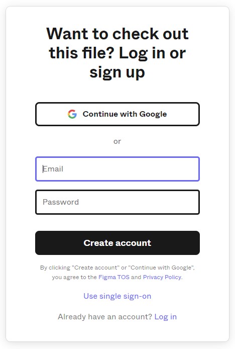
If you are not signed in with Figma, you will be asked to do so. Create an account if you don't have one. Follow the instructions to sign up with your Google account or use a username and password.
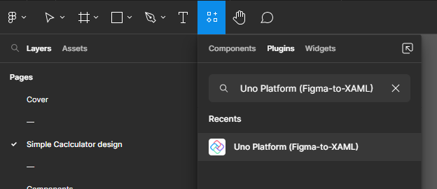
Install the Uno Platform plugin for Figma
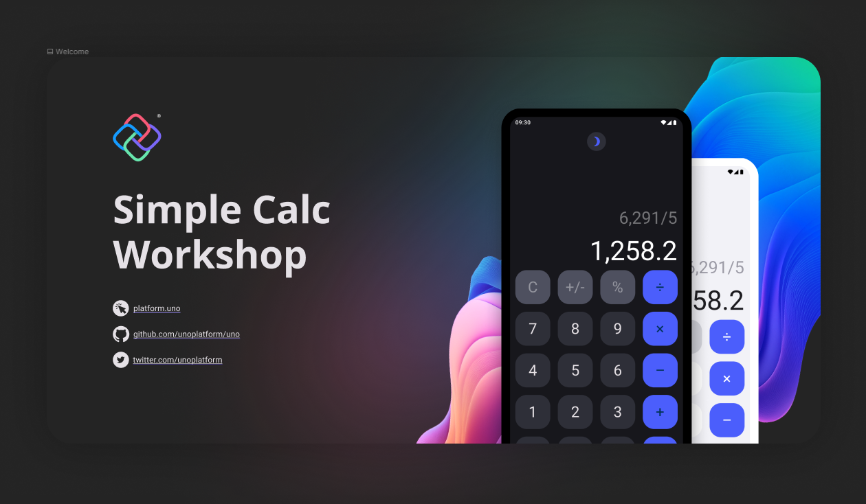
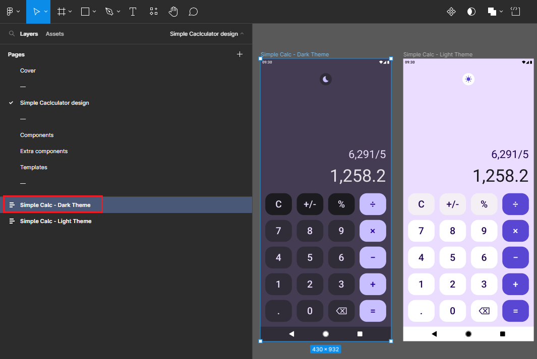
The SimpleCalculator design will open in Figma, displaying the Cover page:
To export the UI from Figma, you'll need to install the Uno Platform plugin. To enable that you will need to create your own copy of the SimpleCalculator design.
In the top menu in the center of the screen click the little down arrow and select Duplicate to your drafts from the menu.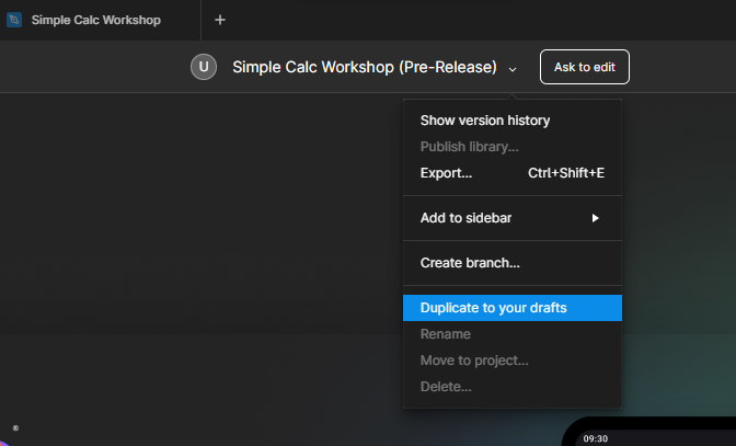
The duplicated file will open in a new tab and additional menu items and controls will appear on the Figma ribbon.
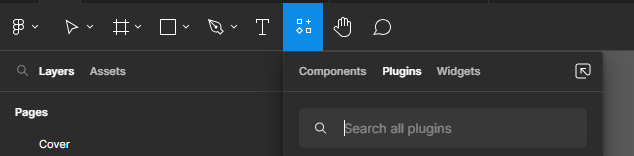
In the search box enter "Uno Platform (Figma-To-XAML)". Launch the plugin by clicking the Uno Platform plugin.
Export the UI
- The page designed in the SimpleCalculator design in Figma is listed in the left-side navigation bar. Select Simple Calculator design, then select Simple Calc (either Dark or Light version) option that appears at the bottom of the sidebar.
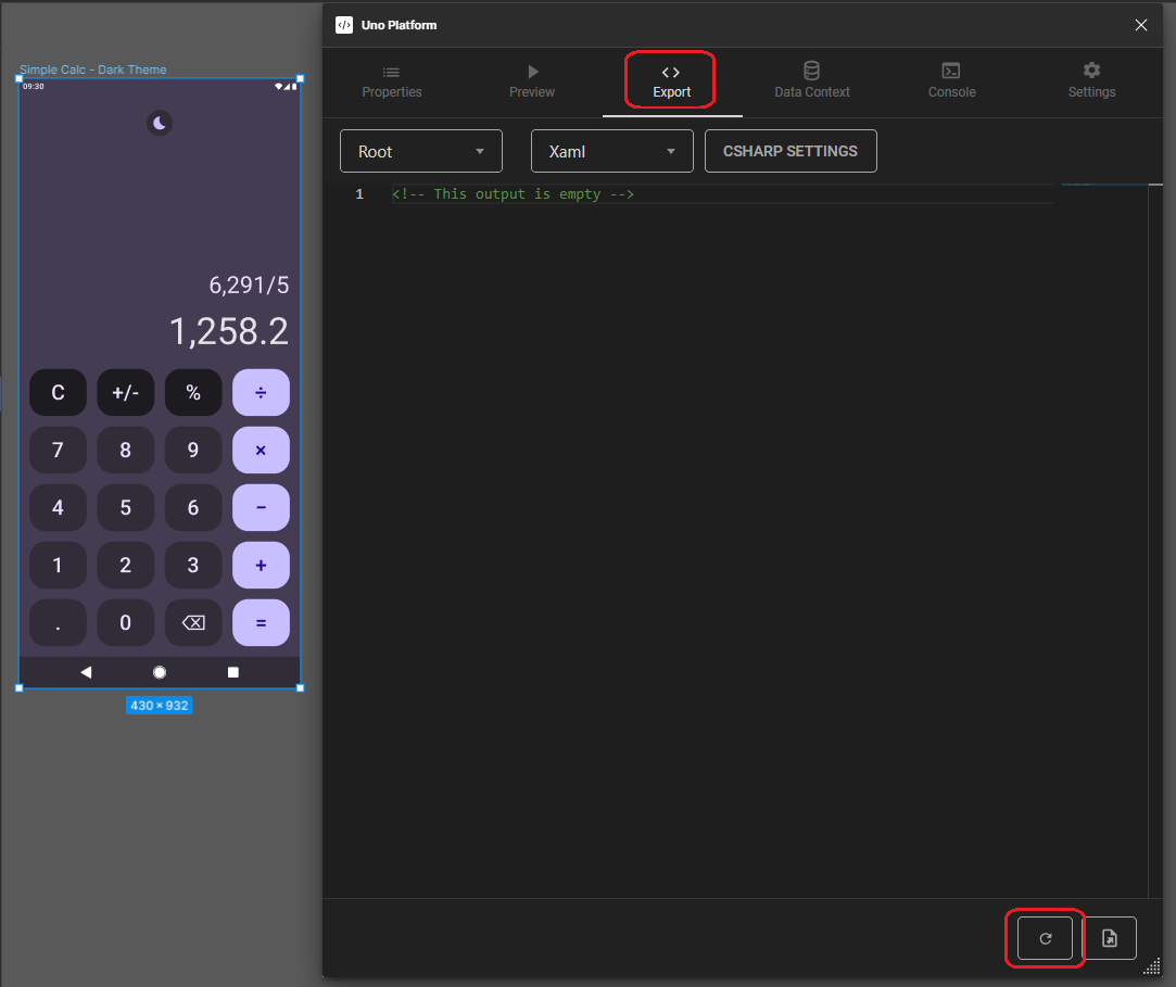
- Open the Export tab, note that Xaml is selected as the markup language to be exported, then click Refresh (the circled arrow button on the bottom).
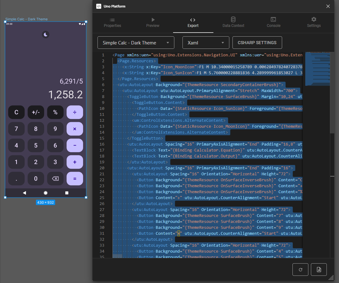
- Select all contents starting from the line
<Page.Resources>until the last</utu:AutoLayout>.
MainPage.xaml code contents (collapsed for brevity)
<Page xmlns:uen="using:Uno.Extensions.Navigation.UI" xmlns:uer="using:Uno.Extensions.Reactive.UI" xmlns:utu="using:Uno.Toolkit.UI" xmlns:utum="using:Uno.Toolkit.UI.Material" xmlns:muxc="using:Microsoft.UI.Xaml.Controls" xmlns:um="using:Uno.Material" xmlns:ut="using:Uno.Themes" xmlns:x="http://schemas.microsoft.com/winfx/2006/xaml" xmlns:mc="http://schemas.openxmlformats.org/markup-compatibility/2006" xmlns:d="http://schemas.microsoft.com/expression/blend/2008" x:Class="SimpleCalculator.MainPage" mc:Ignorable="d" Background="{ThemeResource BackgroundBrush}" utu:StatusBar.Foreground="Light" xmlns="http://schemas.microsoft.com/winfx/2006/xaml/presentation">
  <Page.Resources>
    <x:String x:Key="Icon_MoonIcon">F1 M 10.34000015258789 0.006284978240728378 C 4.590000152587891 -0.19371502473950386 0 4.406285285949707 0 9.986285209655762 C 0 15.506285190582275 4.480000019073486 19.986284255981445 10 19.986284255981445 C 13.710000038146973 19.986284255981445 16.929999828338623 17.96628475189209 18.65999984741211 14.96628475189209 C 11.149999618530273 14.71628475189209 6.570000171661377 6.536285188049078 10.34000015258789 0.006284978240728378 Z</x:String>
    <x:String x:Key="Icon_SunIcon">F1 M 5.760000228881836 4.289999961853027 L 3.9600000381469727 2.5 L 2.549999952316284 3.9100000858306885 L 4.340000152587891 5.699999809265137 L 5.760000228881836 4.289999961853027 Z M 3 9.949999809265137 L 0 9.949999809265137 L 0 11.949999809265137 L 3 11.949999809265137 L 3 9.949999809265137 Z M 12 0 L 10 0 L 10 2.950000047683716 L 12 2.950000047683716 L 12 0 L 12 0 Z M 19.450000762939453 3.9100000858306885 L 18.040000915527344 2.5 L 16.25 4.289999961853027 L 17.65999984741211 5.699999809265137 L 19.450000762939453 3.9100000858306885 Z M 16.239999771118164 17.610000610351562 L 18.030000686645508 19.40999984741211 L 19.440000534057617 18 L 17.639999389648438 16.21000099182129 L 16.239999771118164 17.610000610351562 Z M 19 9.949999809265137 L 19 11.949999809265137 L 22 11.949999809265137 L 22 9.949999809265137 L 19 9.949999809265137 Z M 11 4.949999809265137 C 7.690000057220459 4.949999809265137 5 7.639999866485596 5 10.949999809265137 C 5 14.259999752044678 7.690000057220459 16.950000762939453 11 16.950000762939453 C 14.309999942779541 16.950000762939453 17 14.259999752044678 17 10.949999809265137 C 17 7.639999866485596 14.309999942779541 4.949999809265137 11 4.949999809265137 Z M 10 21.900001525878906 L 12 21.900001525878906 L 12 18.950000762939453 L 10 18.950000762939453 L 10 21.900001525878906 Z M 2.549999952316284 17.990001678466797 L 3.9600000381469727 19.400001525878906 L 5.75 17.600000381469727 L 4.340000152587891 16.190000534057617 L 2.549999952316284 17.990001678466797 Z</x:String>
  </Page.Resources>
  <utu:AutoLayout Background="{ThemeResource SecondaryContainerBrush}">
    <utu:AutoLayout utu:AutoLayout.PrimaryAlignment="Stretch" MaxWidth="700">
      <ToggleButton Background="{ThemeResource SurfaceBrush}" Margin="10,24" utu:AutoLayout.CounterAlignment="Center" CornerRadius="20">
        <ToggleButton.Content>
          <PathIcon Data="{StaticResource Icon_SunIcon}" Foreground="{ThemeResource PrimaryBrush}" />
        </ToggleButton.Content>
        <ut:ControlExtensions.AlternateContent>
          <PathIcon Data="{StaticResource Icon_MoonIcon}" Foreground="{ThemeResource PrimaryBrush}" />
        </ut:ControlExtensions.AlternateContent>
      </ToggleButton>
      <utu:AutoLayout Spacing="16" PrimaryAxisAlignment="End" Padding="16,8" utu:AutoLayout.PrimaryAlignment="Stretch" MinHeight="120">
        <TextBlock Text="{Binding Calculator.Equation}" utu:AutoLayout.CounterAlignment="End" Foreground="{ThemeResource OnSecondaryContainerBrush}" Style="{StaticResource DisplaySmall}" />
        <TextBlock Text="{Binding Calculator.Output}" utu:AutoLayout.CounterAlignment="End" Foreground="{ThemeResource OnBackgroundBrush}" Style="{StaticResource DisplayLarge}" />
      </utu:AutoLayout>
      <utu:AutoLayout Spacing="16" PrimaryAxisAlignment="End" Padding="16">
        <utu:AutoLayout Spacing="16" Orientation="Horizontal" Height="72">
          <Button Background="{ThemeResource OnSurfaceInverseBrush}" Content="C" utu:AutoLayout.CounterAlignment="Start" utu:AutoLayout.PrimaryAlignment="Stretch" Height="72" CornerRadius="24" Style="{StaticResource FilledTonalButtonStyle}" />
          <Button Background="{ThemeResource OnSurfaceInverseBrush}" Content="+/-" utu:AutoLayout.CounterAlignment="Start" utu:AutoLayout.PrimaryAlignment="Stretch" Height="72" CornerRadius="24" Style="{StaticResource FilledTonalButtonStyle}" />
          <Button Background="{ThemeResource OnSurfaceInverseBrush}" Content="%" utu:AutoLayout.CounterAlignment="Start" utu:AutoLayout.PrimaryAlignment="Stretch" Height="72" CornerRadius="24" Style="{StaticResource FilledTonalButtonStyle}" />
          <Button Content="÷" utu:AutoLayout.CounterAlignment="Start" utu:AutoLayout.PrimaryAlignment="Stretch" Height="72" CornerRadius="24" />
        </utu:AutoLayout>
        <utu:AutoLayout Spacing="16" Orientation="Horizontal" Height="72">
          <Button Background="{ThemeResource SurfaceBrush}" Content="7" utu:AutoLayout.CounterAlignment="Start" utu:AutoLayout.PrimaryAlignment="Stretch" Height="72" MinWidth="72" CornerRadius="24" Style="{StaticResource FilledTonalButtonStyle}" />
          <Button Background="{ThemeResource SurfaceBrush}" Content="8" utu:AutoLayout.CounterAlignment="Start" utu:AutoLayout.PrimaryAlignment="Stretch" Height="72" MinWidth="72" CornerRadius="24" Style="{StaticResource FilledTonalButtonStyle}" />
          <Button Background="{ThemeResource SurfaceBrush}" Content="9" utu:AutoLayout.CounterAlignment="Start" utu:AutoLayout.PrimaryAlignment="Stretch" Height="72" MinWidth="72" CornerRadius="24" Style="{StaticResource FilledTonalButtonStyle}" />
          <Button Content="×" utu:AutoLayout.CounterAlignment="Start" utu:AutoLayout.PrimaryAlignment="Stretch" Height="72" MinWidth="72" CornerRadius="24" />
        </utu:AutoLayout>
        <utu:AutoLayout Spacing="16" Orientation="Horizontal" Height="72">
          <Button Background="{ThemeResource SurfaceBrush}" Content="4" utu:AutoLayout.CounterAlignment="Start" utu:AutoLayout.PrimaryAlignment="Stretch" Height="72" MinWidth="72" CornerRadius="24" Style="{StaticResource FilledTonalButtonStyle}" />
          <Button Background="{ThemeResource SurfaceBrush}" Content="5" utu:AutoLayout.CounterAlignment="Start" utu:AutoLayout.PrimaryAlignment="Stretch" Height="72" MinWidth="72" CornerRadius="24" Style="{StaticResource FilledTonalButtonStyle}" />
          <Button Background="{ThemeResource SurfaceBrush}" Content="6" utu:AutoLayout.CounterAlignment="Start" utu:AutoLayout.PrimaryAlignment="Stretch" Height="72" MinWidth="72" CornerRadius="24" Style="{StaticResource FilledTonalButtonStyle}" />
          <Button Content="−" utu:AutoLayout.CounterAlignment="Start" utu:AutoLayout.PrimaryAlignment="Stretch" Height="72" MinWidth="72" CornerRadius="24" />
        </utu:AutoLayout>
        <utu:AutoLayout Spacing="16" Orientation="Horizontal" Height="72">
          <Button Background="{ThemeResource SurfaceBrush}" Content="1" utu:AutoLayout.CounterAlignment="Start" utu:AutoLayout.PrimaryAlignment="Stretch" Height="72" MinWidth="72" CornerRadius="24" Style="{StaticResource FilledTonalButtonStyle}" />
          <Button Background="{ThemeResource SurfaceBrush}" Content="2" utu:AutoLayout.CounterAlignment="Start" utu:AutoLayout.PrimaryAlignment="Stretch" Height="72" MinWidth="72" CornerRadius="24" Style="{StaticResource FilledTonalButtonStyle}" />
          <Button Background="{ThemeResource SurfaceBrush}" Content="3" utu:AutoLayout.CounterAlignment="Start" utu:AutoLayout.PrimaryAlignment="Stretch" Height="72" MinWidth="72" CornerRadius="24" Style="{StaticResource FilledTonalButtonStyle}" />
          <Button Content="+" utu:AutoLayout.CounterAlignment="Start" utu:AutoLayout.PrimaryAlignment="Stretch" Height="72" MinWidth="72" CornerRadius="24" />
        </utu:AutoLayout>
        <utu:AutoLayout Spacing="16" Orientation="Horizontal" Height="72">
          <Button Background="{ThemeResource SurfaceBrush}" Content="." utu:AutoLayout.CounterAlignment="Start" utu:AutoLayout.PrimaryAlignment="Stretch" Height="72" MinWidth="72" CornerRadius="24" Style="{StaticResource FilledTonalButtonStyle}" />
          <Button Background="{ThemeResource SurfaceBrush}" Content="0" utu:AutoLayout.CounterAlignment="Start" utu:AutoLayout.PrimaryAlignment="Stretch" Height="72" MinWidth="72" CornerRadius="24" Style="{StaticResource FilledTonalButtonStyle}" />
          <Button Background="{ThemeResource SurfaceBrush}" Content="⌫" utu:AutoLayout.CounterAlignment="Start" utu:AutoLayout.PrimaryAlignment="Stretch" Height="72" MinWidth="72" CornerRadius="24" Style="{StaticResource FilledTonalButtonStyle}" />
          <Button Content="=" utu:AutoLayout.CounterAlignment="Start" utu:AutoLayout.PrimaryAlignment="Stretch" Height="72" MinWidth="72" CornerRadius="24" />
        </utu:AutoLayout>
      </utu:AutoLayout>
    </utu:AutoLayout>
  </utu:AutoLayout>
</Page>
Copy the selected code to the clipboard (Ctrl+C on Windows).
Open MainPage.xaml and replace all the Page contents with the copied code.
To set the appropriate font size for all buttons, access the MaterialFontsOverride.xaml file in the Style folder. Go to the Figma Plugin, in the Export tab, and select Fonts Override File from the dropdown menu. Copy the content in the ResourceDictionary and replace it in your MaterialFontsOverride.xaml file.
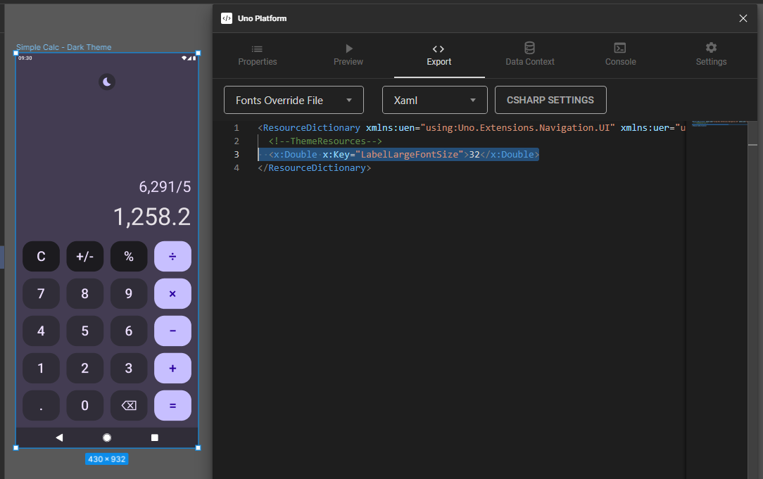
MaterialFontsOverride.xaml code contents (collapsed for brevity)
<ResourceDictionary xmlns:x="http://schemas.microsoft.com/winfx/2006/xaml" xmlns="http://schemas.microsoft.com/winfx/2006/xaml/presentation">
  <!--ThemeResources-->
  <x:Double x:Key="LabelLargeFontSize">32</x:Double>
</ResourceDictionary>
- Now we need to prepare our UI with the Binding expressions that we will need in the App Architecture module. For all buttons we need to add
Command="{Binding InputCommand}"andCommandParameterthat will receive the same content as theContentattribute. For example, the first button would then be:
<Button Background="{ThemeResource OnSurfaceInverseBrush}"
        Content="C"
        utu:AutoLayout.CounterAlignment="Start"
        utu:AutoLayout.PrimaryAlignment="Stretch"
        Height="72"
        CornerRadius="24"
        Style="{StaticResource FilledTonalButtonStyle}"
        CommandParameter="C"
        Command="{Binding InputCommand}" />
Last we need to update our ToggleButton with the Binding expression IsChecked="{Binding IsDark, Mode=TwoWay}" for the theme switching (Light and Dark).
<ToggleButton Background="{ThemeResource SurfaceBrush}"
              Margin="10,24"
              utu:AutoLayout.CounterAlignment="Center"
              CornerRadius="20"
              IsChecked="{Binding IsDark, Mode=TwoWay}">
...
</ToggleButton>
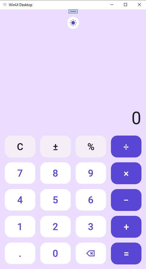
Run the app
Run the app (F5 on Visual Studio) and observe the UI, it should look similar to the following:
Next Step
The next module offers an alternative way to import the UI code without Figma. Since you've already imported the UI, you may skip to Module 4, where you will add the app architecture.